Event Visual Design for Wander Case Color Launch
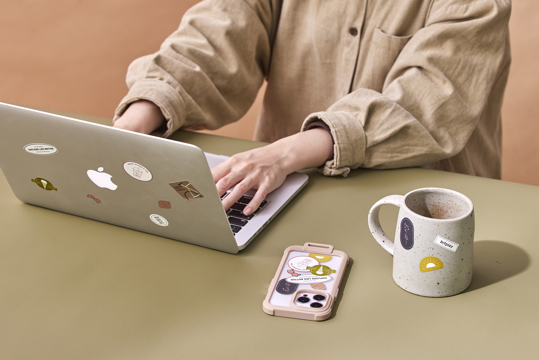
This campaign visual design focuses on stickers as the core storytelling element, positioning them as more than add-ons and instead as expressive tools for personalizing everyday objects.
About the project
Designing a campaign visual that elevates stickers as a core product experience.
This project was created for the launch of new colorways for bitplay’s Wander Case.
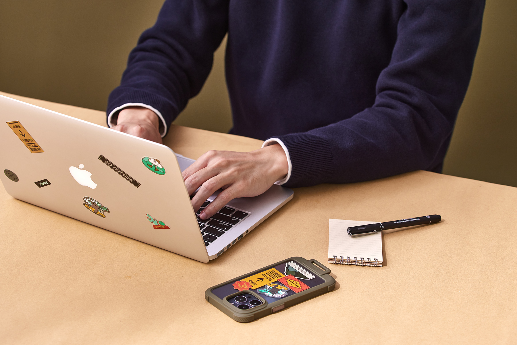
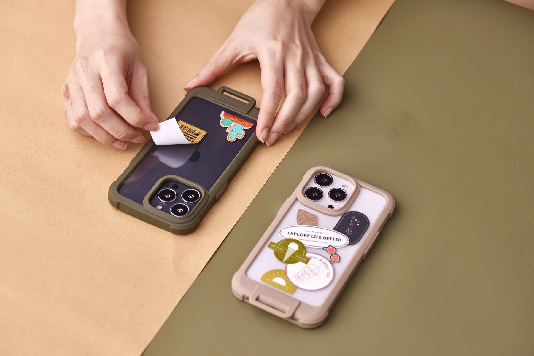
Each phone case was paired with a dedicated sticker set, designed to encourage personalization and interaction as part of everyday use.
Rather than treating stickers as secondary accessories, the campaign reframed them as an essential visual and emotional component of the product, extending the story beyond color updates into a lifestyle-driven experience.
Challanges
Making stickers visually dominant within a product-led campaign.
As a small-scale element, stickers are often visually overshadowed by the product itself. The challenge was to ensure their presence remained clear and impactful across key visuals, lifestyle scenes, and model photography.
At the same time, the campaign needed to support multiple product colorways while maintaining a cohesive brand tone and visual consistency across all assets.
Concept
Transforming stickers into objects that feel collected, shared, and experienced.
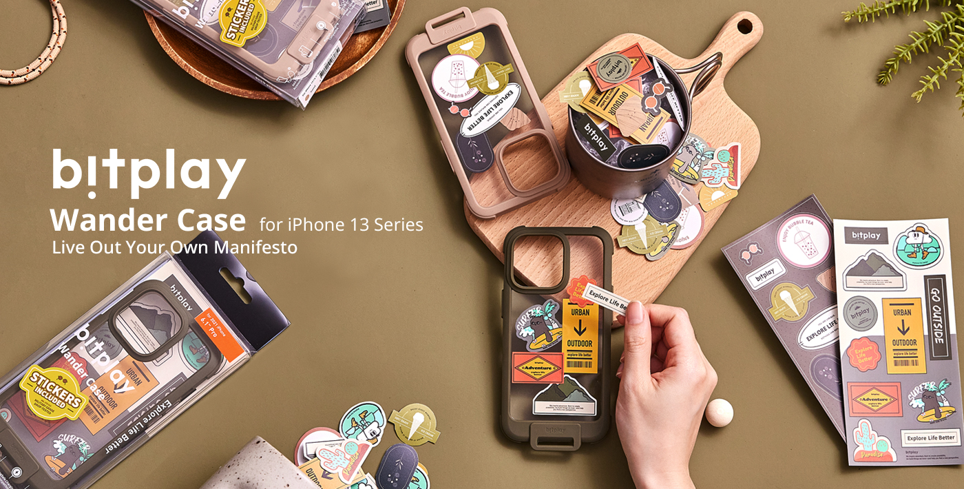
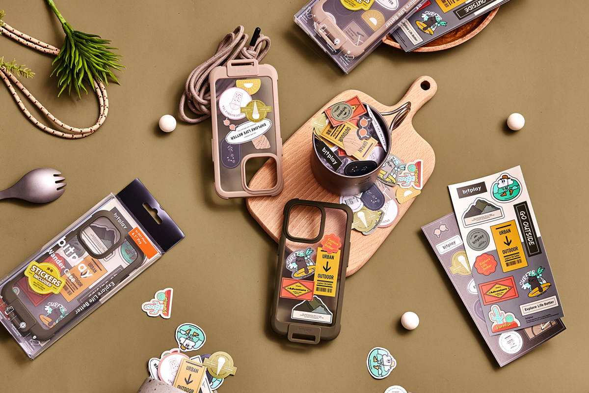
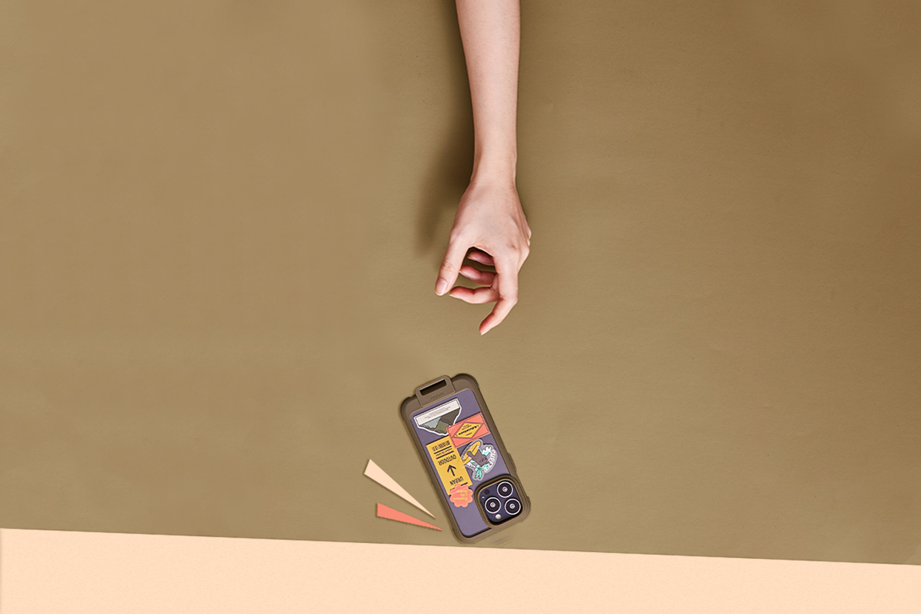
The core visual concept draws inspiration from an afternoon tea setting, where stickers are treated as tangible elements placed on tabletops, plates, and inside mugs.
This approach frames stickers as items to be selected and enjoyed, rather than flat decorative graphics.
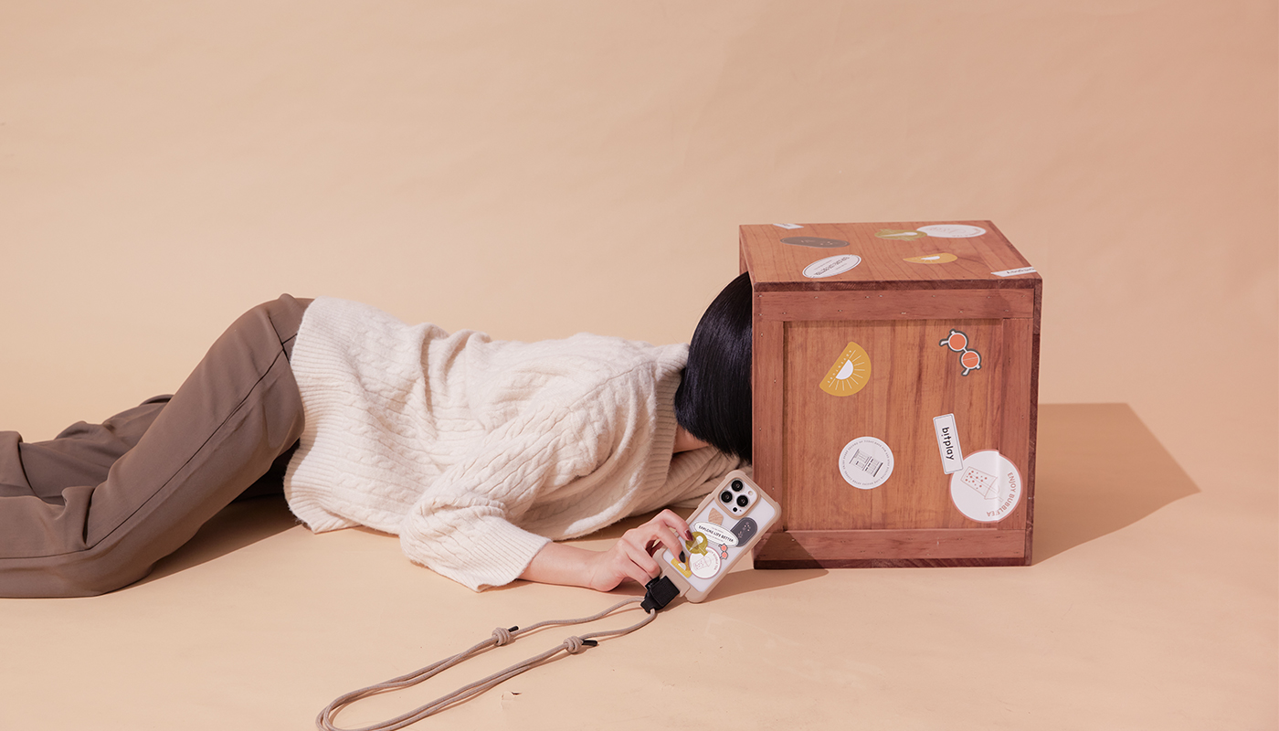
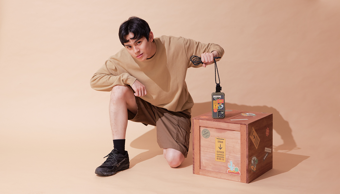
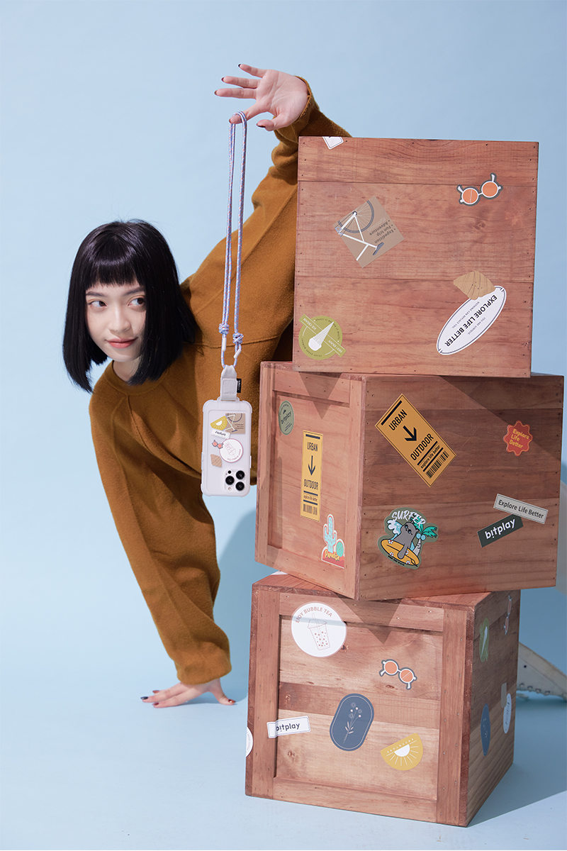
For lifestyle and model imagery, enlarged sticker applications were introduced on wooden crates, allowing the stickers to become part of the spatial structure of each scene.
By integrating them into the environment, the visuals reinforce stickers as a defining feature of the product experience.
Sketch