

SPARK88 Bellydance Studio
Brand Identity & Visual SystemA community-driven belly dance studio brand focused on body awareness, confidence, and long-term growth.
Project Overview
Unlike many belly dance studios that center around individual instructors, SPARK88 positions the studio itself as the brand, focusing on the collective experience of learning, movement, and self-connection.
This project involved a full brand refresh, including logo design, visual identity, and a scalable system for digital and physical touchpoints.
The Challenge
The main challenge was redefining how a belly dance studio could present itself as a brand.
The visual direction needed to move away from teacher-centric or performance-driven imagery, while still communicating professionalism, trust, and structure.
At the same time, the identity had to express the essence of belly dance as a body-centered practice that supports long-term confidence, emotional balance, and personal growth, without feeling overly decorative or superficial.
Brand Concept & Logo Design
The logo concept is rooted in SPARK88’s slogan, “Find your inner spark, shine ∞∞ times.”
The infinity symbol serves as the core structure of the mark, representing continuous movement, balance, and the cyclical nature of inner growth.
As belly dance is centered around the body’s core, the symbol reinforces the idea of movement originating from within. Subtle star-like details reference “spark” and “shine,” expressing moments of energy, confidence, and self-recognition through dance.
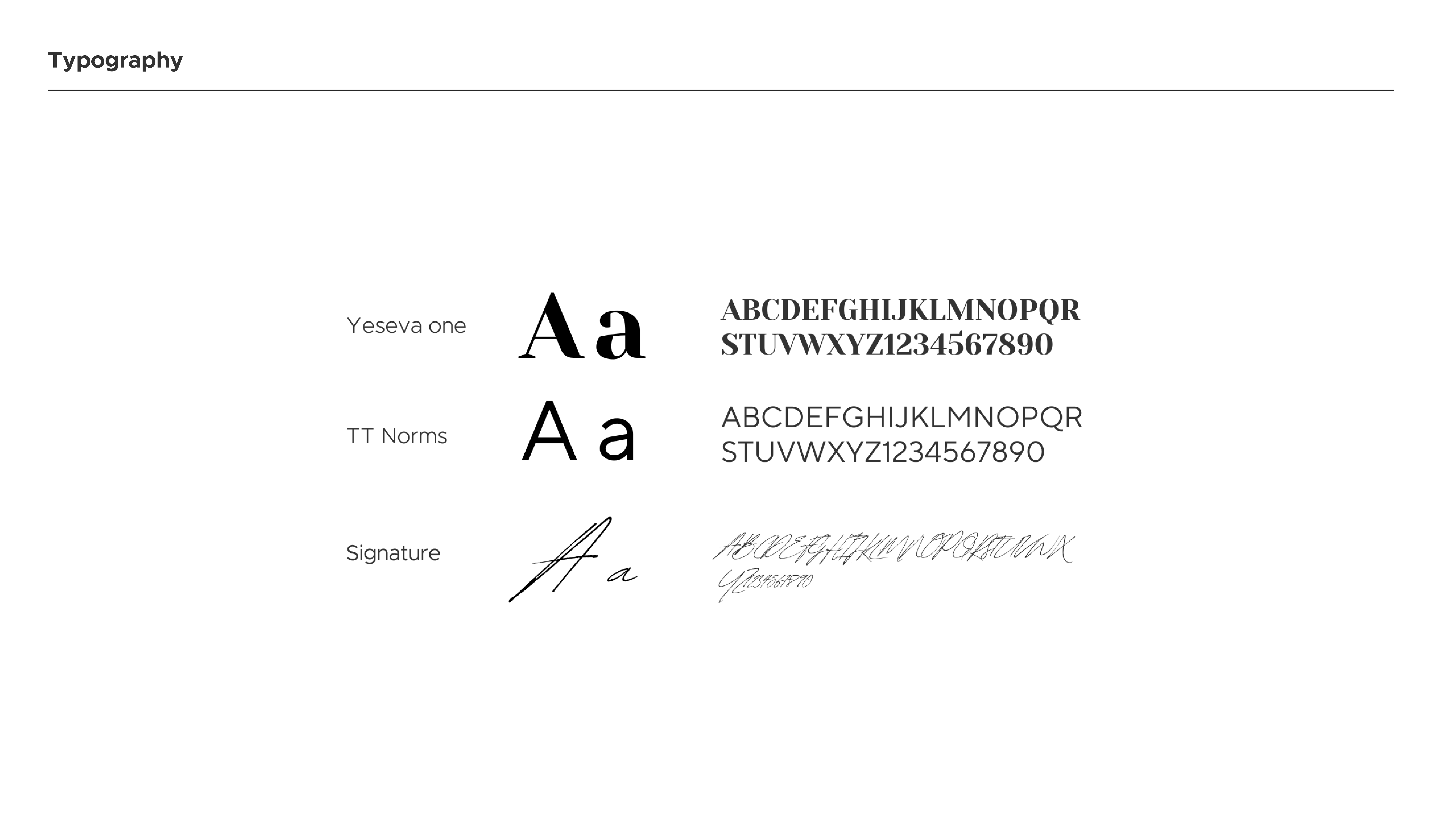
Visual System
The visual system combines soft lavender tones with deeper purples to balance warmth and stability.
Typography pairs a refined serif with a clean sans-serif, allowing the brand to feel expressive yet grounded.
Patterns derived from the logo extend naturally across applications, reinforcing consistency while adding personality to digital and physical materials.


Outcome
The refreshed brand identity helped SPARK88 establish a clear, studio-first positioning within the local dance community.
The new visual language strengthened brand recognition and supported consistent storytelling across marketing channels.
Following the rebrand and content rollout, the studio saw measurable growth in social engagement and audience connection, reinforcing the brand’s focus on community, confidence, and long-term practice.
This project reflects my approach to building brand systems that are emotionally resonant, strategically grounded, and scalable across channels.