
Brand Design
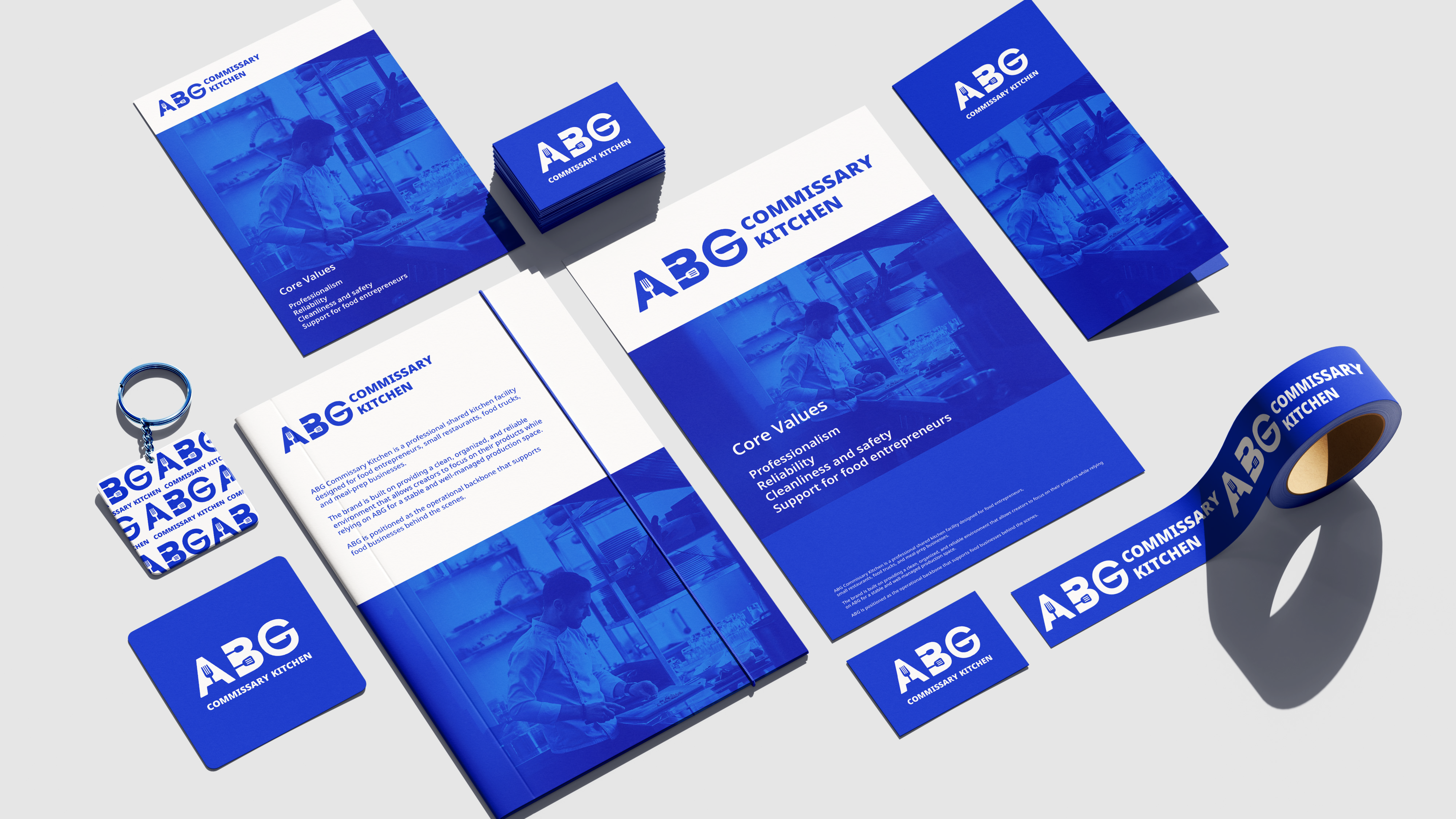
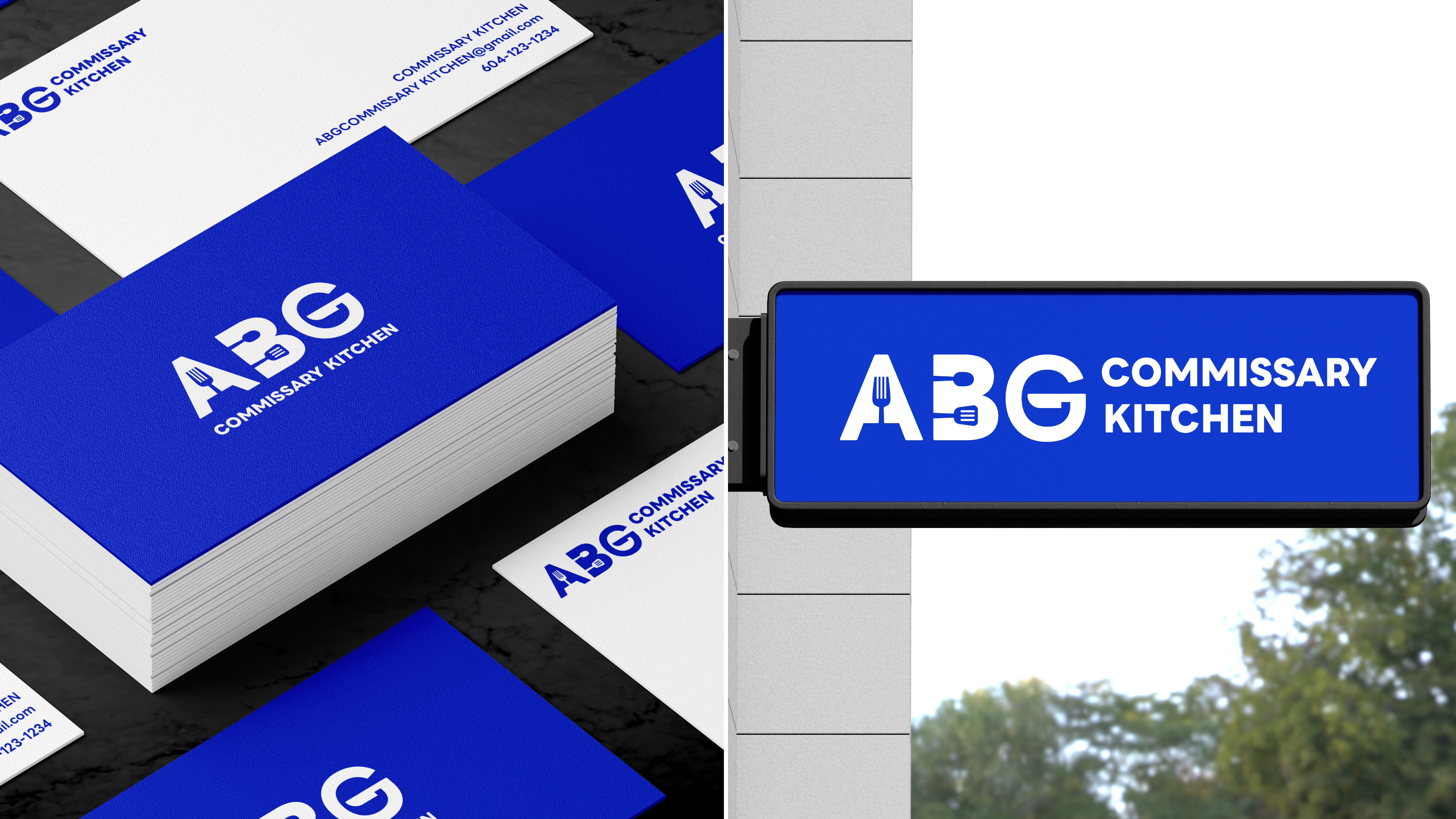
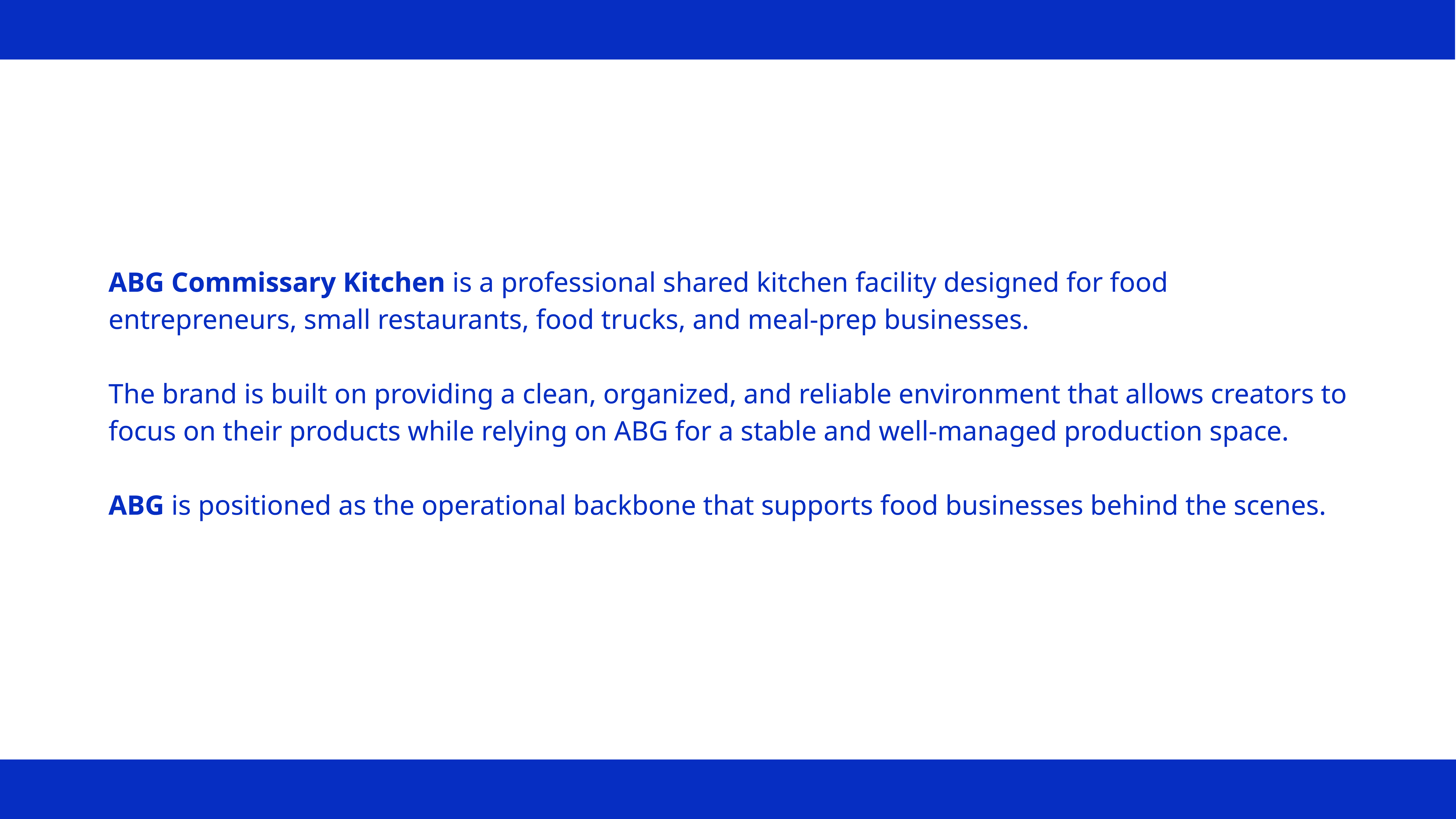
ABG Commissary Kitchen is a shared commercial kitchen designed to support food entrepreneurs, small restaurants, and local food businesses.
The brand operates behind the scenes, providing a clean, organized, and reliable production environment that allows creators to focus on what they do best.
This project explored how a clear and functional brand identity can communicate trust, professionalism, and operational stability within a B2B service context.
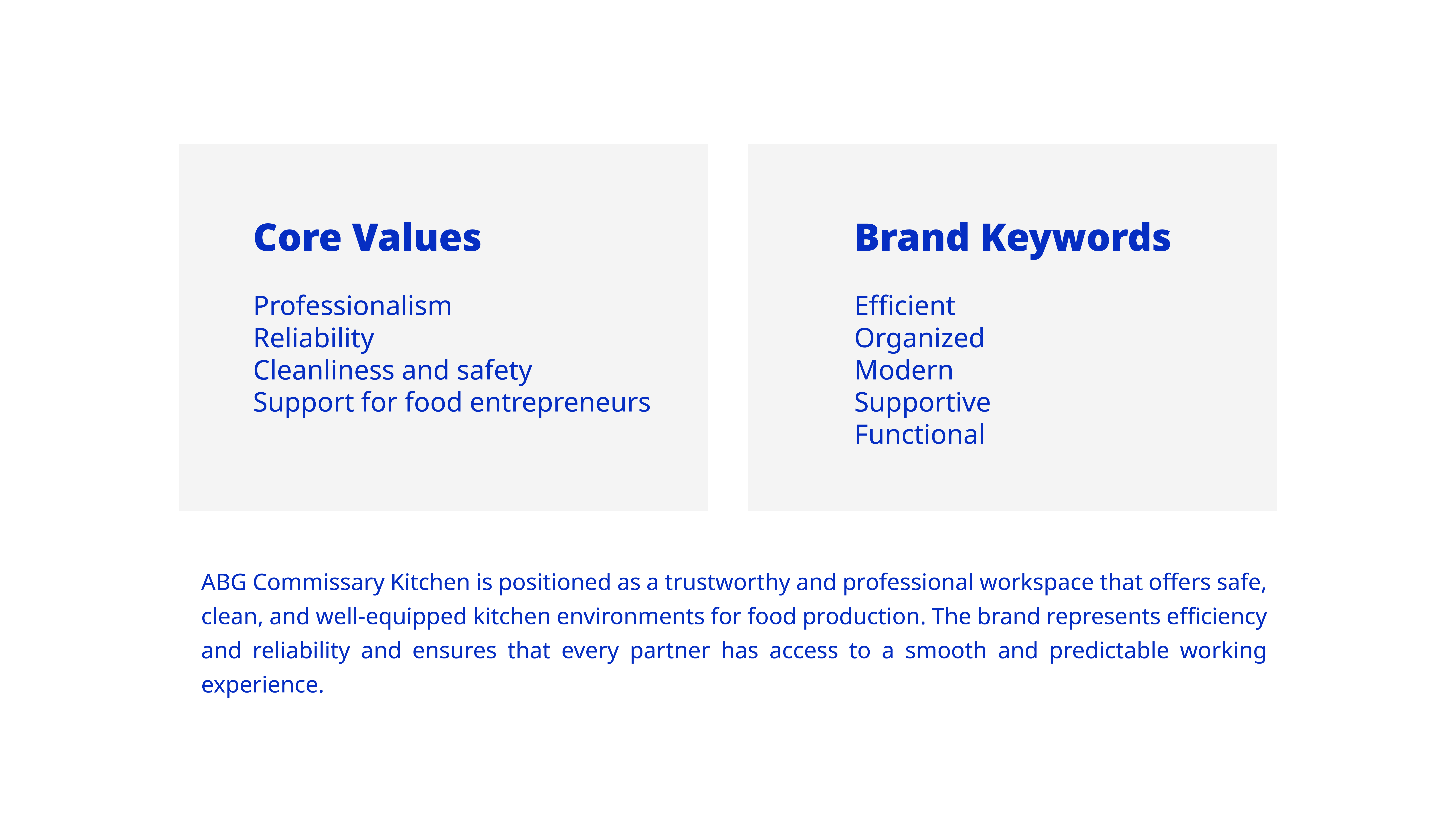
Designing for a commissary kitchen meant prioritizing clarity and reliability without losing warmth or relevance.
ABG needed an identity that felt professional and dependable, while still resonating with the energy of diverse food creators working in a shared space.
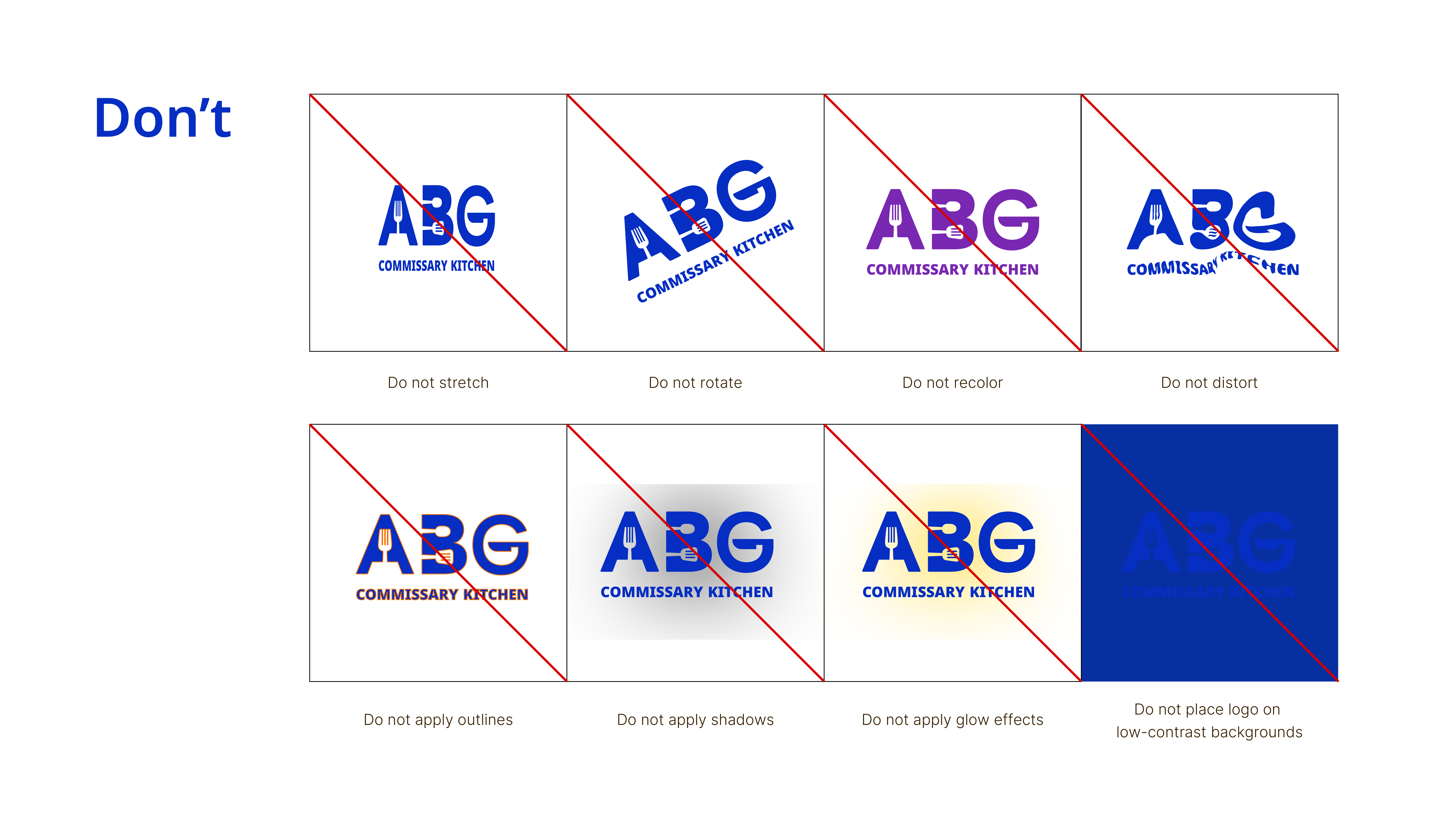
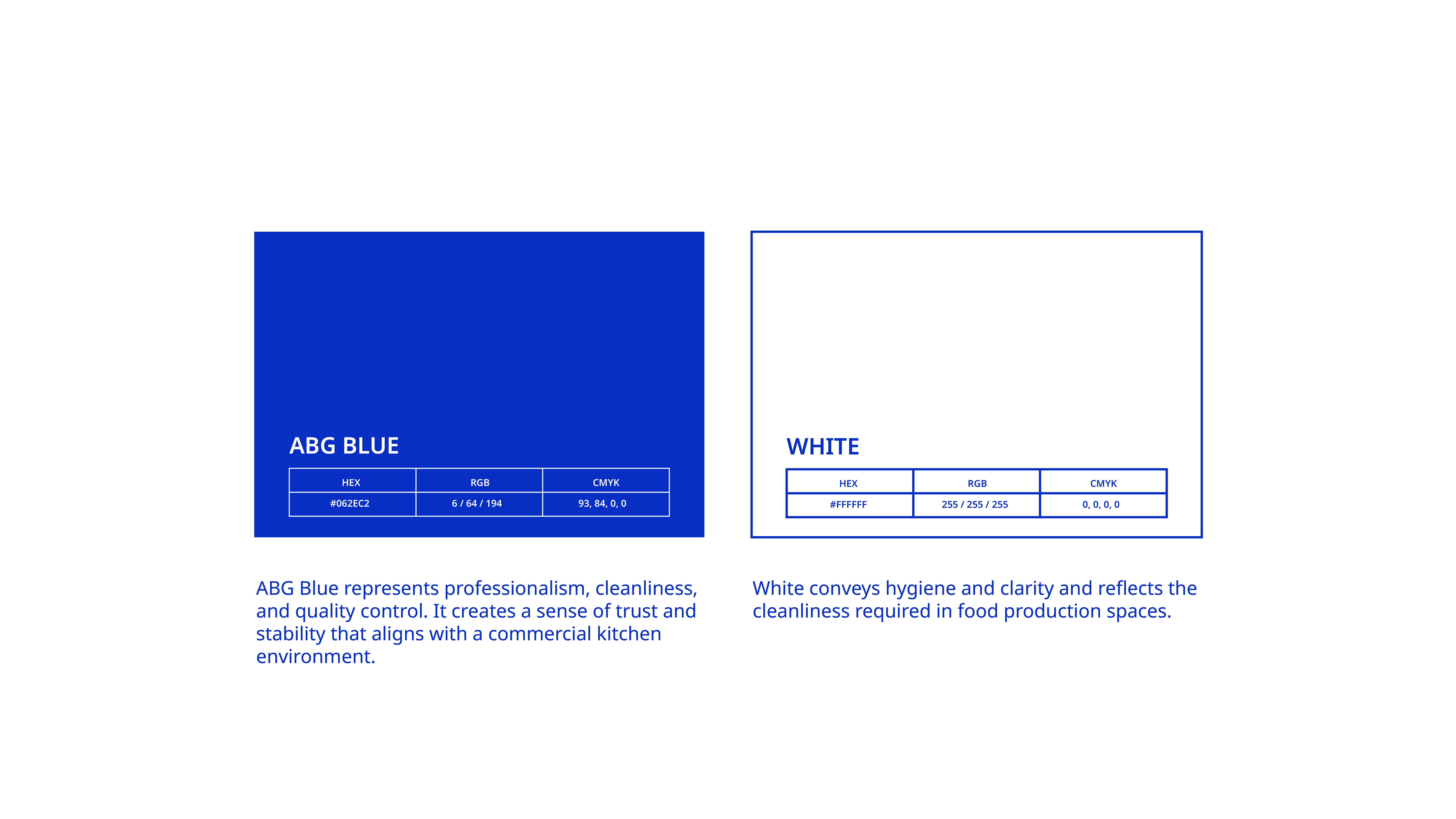
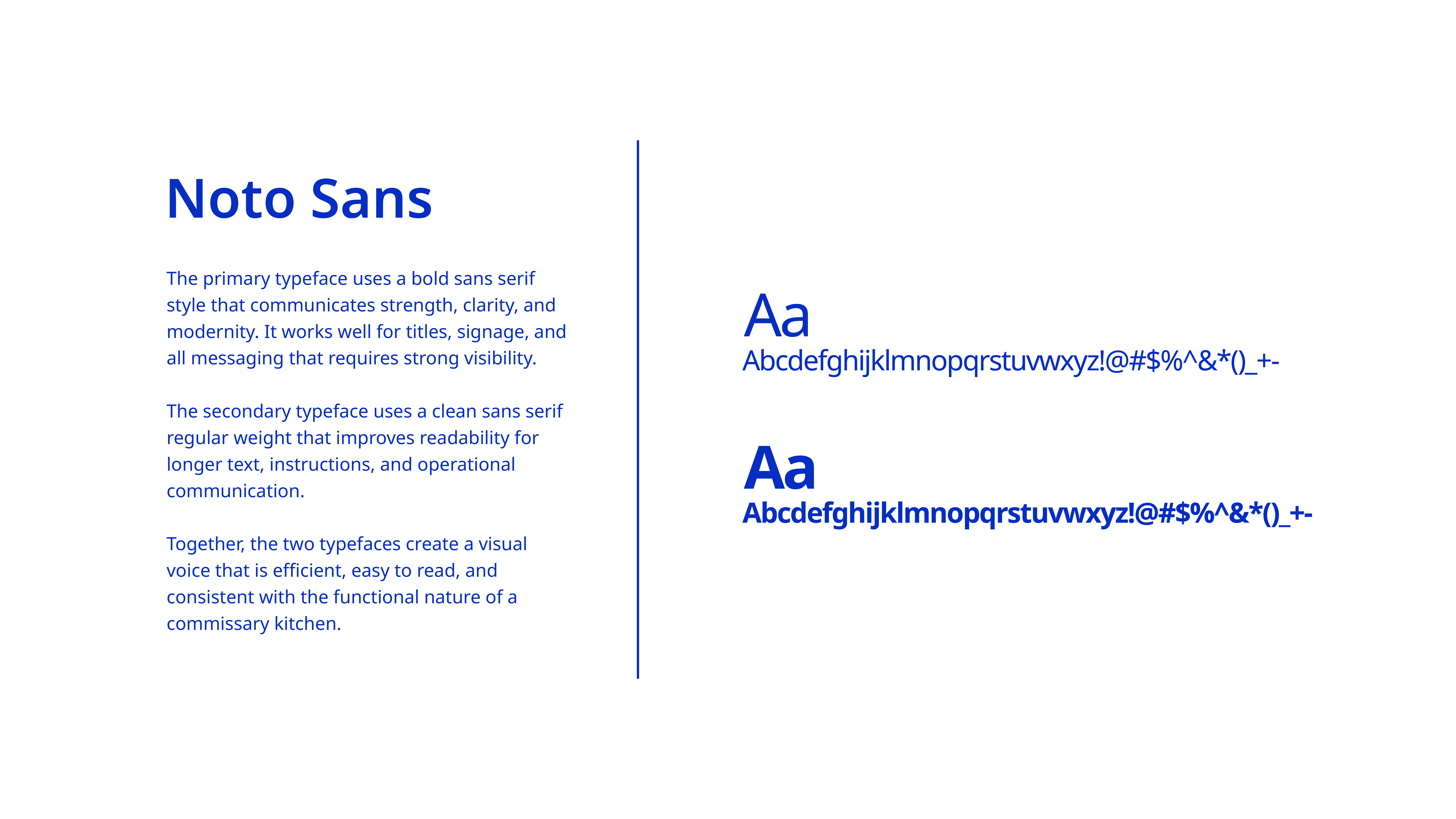
The challenge was to avoid visual complexity and trends, and instead build a system that could scale across signage, printed materials, and daily operational use while remaining easy to apply and maintain.
![]()
![]()
![]()
![]()
![]()
![]()
![]()
![]()
![]()
![]()
![]()
![]()
![]()
![]()
![]()
![]()
![]()
ABG Commissary Kitchen
About the project
ABG Commissary Kitchen is a shared commercial kitchen designed to support food entrepreneurs, small restaurants, and local food businesses.
The brand operates behind the scenes, providing a clean, organized, and reliable production environment that allows creators to focus on what they do best.
This project explored how a clear and functional brand identity can communicate trust, professionalism, and operational stability within a B2B service context.
Challenges
Designing for a commissary kitchen meant prioritizing clarity and reliability without losing warmth or relevance.
ABG needed an identity that felt professional and dependable, while still resonating with the energy of diverse food creators working in a shared space.
The challenge was to avoid visual complexity and trends, and instead build a system that could scale across signage, printed materials, and daily operational use while remaining easy to apply and maintain.


Summary
ABG emerged with a clean, system-driven visual identity built for consistency, clarity, and long-term use.
The final brand system balances strong typography, restrained color, and functional structure to support real-world applications in a working kitchen environment.
Though modest in scope, this project represents an important step in my design journey, reflecting my growing focus on thoughtful, practical, and scalable brand systems.